
|
|
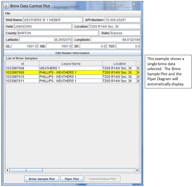
Brine Data Plots - Single Record Selected |
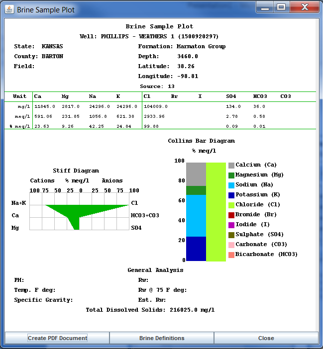
Stiff Diagram: The Stiff diagram is a graphical representation of brine fluid, first developed by H.A.Stiff in 1951. It is usually plotted without the labeled axis and is useful making visual comparison of waters with different characteristics. The patterns tend to maintain its shape upon concentration or dilution.
Collins Bar Diagram: Collins diagrams (Collins 1923) present the relative major ion composition in percent milliequivalent per liter. Both the cations and anions have a total of 100 %. The bar diagram used in the Brine Sample Plot, the cations are plotted on the left and the anions are plotted on the right.
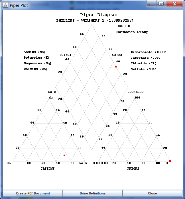
Piper Diagram: The Piper diagram plots the major ions as percentages of milli-equivalents in two base triangles. The total cations and the total anions are set equal to 100% and the data points in the two triangles are projected onto an adjacent grid. This plot reveals useful properties and relationships for large sample groups. The main purpose of the Piper diagram is to show clustering of data points to indicate samples that have similar compositions.
Reference:
Stiff, H.A., Jr., 1951, The interpretation of chemical water analysis by means of patterns:
Journal of Petroleum Technology, v. 3. no. 10, p. 15-17.
COLLINS, W.D. (1923): Graphic presentation of water analysis. Ind. Eng. Chem., 15: 394 p.
Piper, Arthur M.: A graphic procedure in the geochemical interpretation of water-analyses,
Transactions, American Geophysical Union, Volume 25, Issue 6, p. 914-928
Author: John R. Victorine jvictor@kgs.ku.edu