
|
|
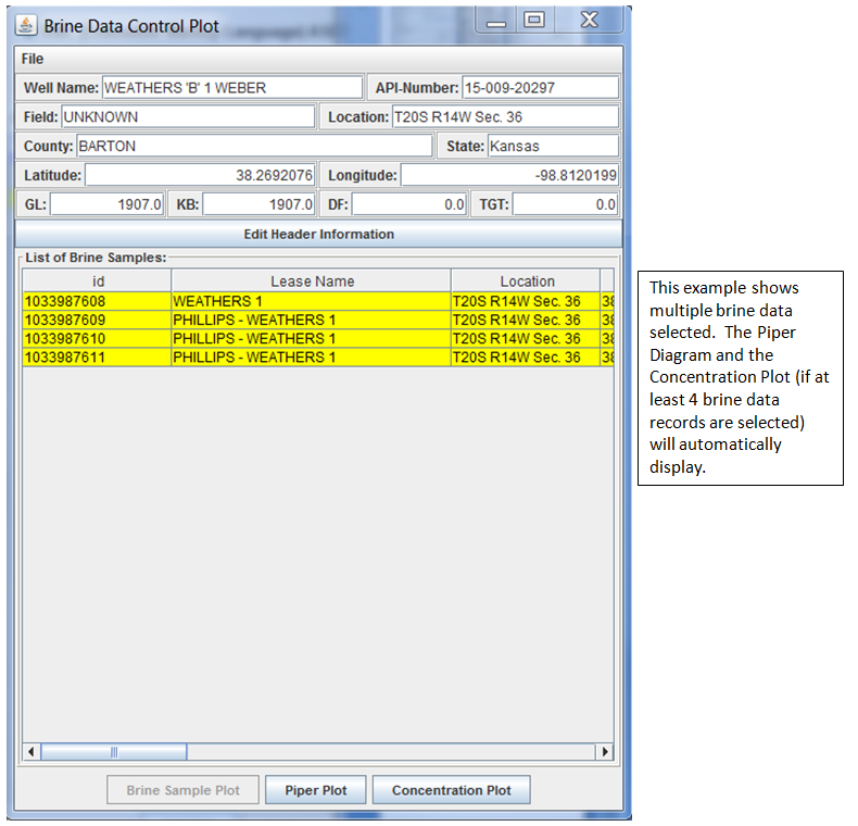
Brine Data Plots - Multiple Records Selected |
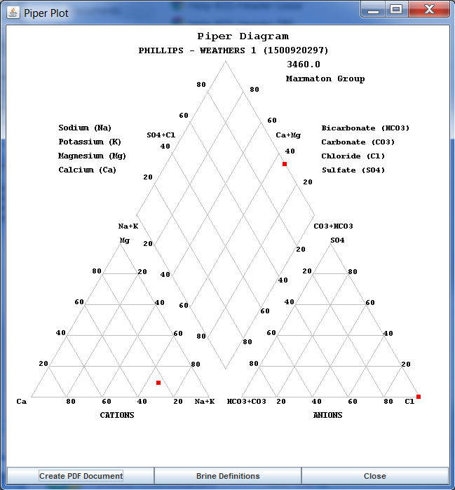
Piper Diagram: The Piper diagram plots the major ions as percentages of milli-equivalents in two base triangles. The total cations and the total anions are set equal to 100% and the data points in the two triangles are projected onto an adjacent grid. This plot reveals useful properties and relationships for large sample groups. The main purpose of the Piper diagram is to show clustering of data points to indicate samples that have similar compositions.
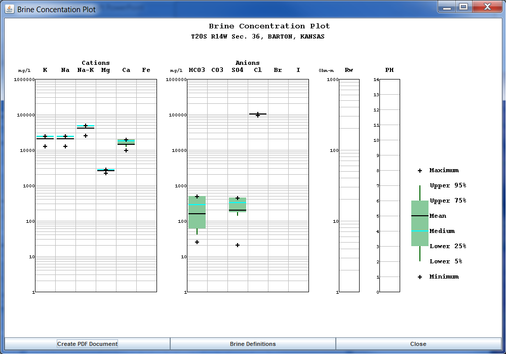
Concentration Plot: Box and whiskers plot showing the distributions of the measured concentrations. Boxes extend from the 25th to the 75th percentile, horizontal bars inside the boxes represent the median and the mean, vertical line to the 5th and 95th percentile and the maximum and minimum observations presented as crosses.
Reference:
Piper, Arthur M.: A graphic procedure in the geochemical interpretation of water-analyses,
Transactions, American Geophysical Union, Volume 25, Issue 6, p. 914-928
Author: John R. Victorine jvictor@kgs.ku.edu