
The visualization tab is where you look at the results of classification, or clustering runs. There are a variety of ways to look at the data; which one is best for your situation depends upon what you are trying to accomplish. The following chart gives a quick overview and identifies the strengths of each visualization option.
| Visualization Method | Summary Description | Strengths of this Method | |
|---|---|---|---|
| Visualize with Standard Axes | Plots a 2D map of the data points, colored by cluster, using longitude/latitude coordinates and a geographic projection. | This visualization is useful for seeing geographic relationships and making high-level comparisons with expert analyses. | |
| Visualize with User-Selected Axes | Plots the data in 2D using the user-selected variables as coordinates. Each cluster is displayed in a unique color. | This visualization is useful for seeing how well the clusters map to natural breaks in the data space and discovering outliers and potentially bad data. | |
| Overlay Visualization (standard axes) |
Plots a standard visualization of the data points, and then overlays one selected variable on top of it. The overlaid variable is divided into classes, with each class receiving a different color. | If the variable was not used to generate the clusters, this is one way to examine how well the clusters predict a particular variable or expert classification. If the variable was used to generate the clusters, this provides a graphical representation of how the clusters track, or are influenced by the variable. | |
| Dual Visualization (standard axes) |
Plots two clusterings of the same data set using latitude/longitude, one on top of the other. | This visualization is useful for comparing two clusterings created using different variables or variable weightings. |
For all visualizations, if the relate colors to similarity box is not checked, the the colors are selected for maximum differentiability between the clusters. If the box is checked, then the colors are selected so that similar clusters get similar colors.
To execute a standard visualization, select a file in the large list box in the View tab and then click on the Visualize button. For standard axes (latitude/longitude), make sure the Standard Axes checkbox is checked.
The following image demonstrates a standard visualization with standard axes. This example is a 12 cluster result of the Australia Coast data set.
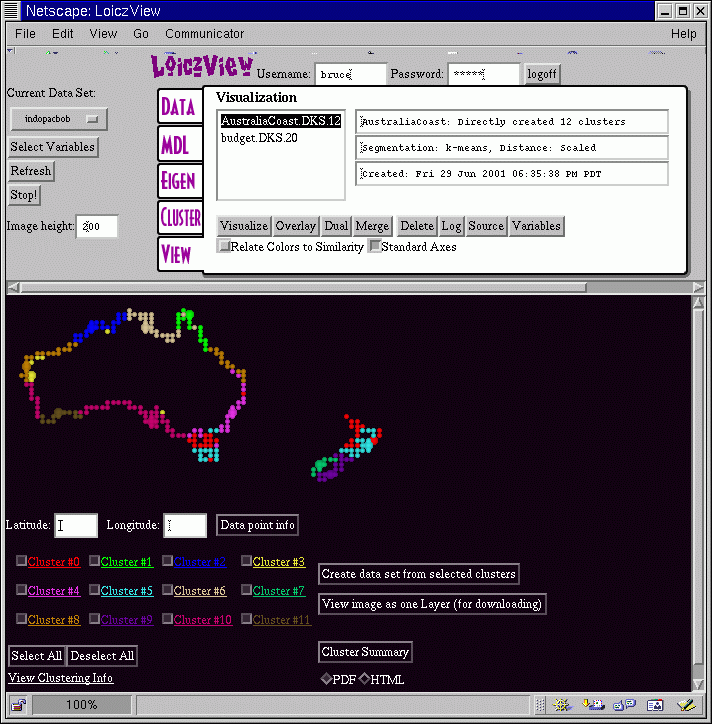
This screen provides a large amount of information about the data set and the clustering results. To begin with, when you click on a file to visualize inside the View tab the fields to the right of the file display information about the cluster file. The top line indicates the name of the data set, and whether the clusters were created directly, or are the result of merging together a larger number of clusters. The second line indicates the method used to classify the data and the distance measure. Finally, the third line provides a unique time stamp. This information lets you quickly identify exactly which clustering result you want to visualize.
The image height field lets you control the height of the visualization image. In this example it is 200, which permits all of the visualization information to fit on the screen at once. For printing, or visualizing larger data sets, you may want to make this value larger. Note that the bigger you make it, the longer it takes to upload the images to your computer.
In the visualization image itself the clusters each have a unique color. For each of the twelve clusters in this example, there is also a checkbox next to some highlighted text in the identical color. If you uncheck a box, the associated cluster will turn grey. Clicking on the Select All or the Deselect All buttons has the effect of checking or unchecking all of the boxes. Being able to turn a cluster on and off makes it easier to see the extent of particular clusters in the image. If you click on the colored text, the program will send up a new window that has statistical information about that cluster, including the mean, standard deviation, and max and min values for each variable.
If you click on the image itself, you will get a large cross-hair, and the latitude and longitude of the closest data point will display on the two text fields. You can then get the actual data values for that data point by clicking on the Data point info button. Points that may be of particular interest to examine are the archetype points, which are shown at double size in the visualization. The archetype point in each cluster is the data point that is closest to that cluster's mean value. Thus, the archetype is a typical point for that cluster.
The Cluster Summary button is a way of saving all of the key information associated with a visualization in a compact form. You can choose whether the cluster summary is in pdf or html format. Note, if you want to include the cluster summary information in another document, choose the html format.
In some situations, you may wish to select a subset of the clusters to recluster in order to get a finer resolution in some areas. The Create data set from selected clusters builds a new data from the currently selected clusters, just as it says. You can then work with this subset of the data as its own data set and recluster it as you wish.
Finally, the View image as one Layer (for downloading) button is also self-explanatory. If you want to include the visualization image in another document, use this button to get a useful version of the image. The standard visualization map is actually multiple layers to facilitate turning individual clusters on and off.
To execute a visualization with user-selected axes, first un-check the Standard Axes checkbox in the View tab. Then select a cluster file in the large list box and click on the Visualize button. WLV will then ask you to select which variables you wish to use as axes for plotting. After selecting the axes, click on the Visualize button in the lower frame to continue.
The example below shows the visualization screen for the Australia Coast data set displayed using the minsst and maxsst (sea surface temperature) variables as the axes.
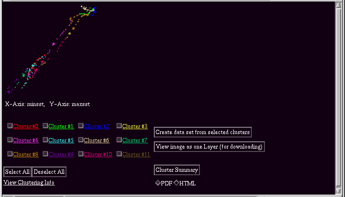
The functionality of this screen is similar to the standard visualization. The only major difference is the change in axes. In this visualization, it is clear that sea surface temperature, while a strong influence in the clustering, is not the major cause of the divisions. The other item to note is that minimum and maximum sea surface temperature generally vary proportionately, as one would expect. However, there are differences between the two coasts of Australia.
To execute an overlay visualization, select a cluster file in the large list box in the View tab, then click on the Overlay button. Then select which variable to overlay. If the variable is a continuous variable, enter how many classes to use in the visualization. Then click Select to continue.
The example below shows the visualization screen for the Australia Coast data set displayed with maxsst (sea surface temperature) overlaid on top of a 12-cluster result.
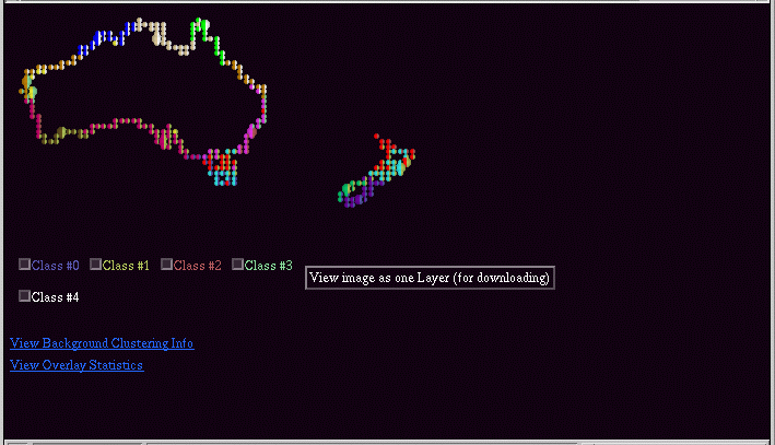
In the overlay case, the colored text markers below the image correspond to subdivisions of the overlaid variable. Probably the most important feature of this visualization is the overlay statistics button. This brings up a window with tables indicating the percentage of overlap between the variable classes and the computed clusters.
When executing an overlay visualization, you can use either a discrete or a continuous variable. The program will automatically determined whether a variable is discrete. If the variable appears to be continuous, it will divide the overlay variable into the specified number of classes. Currently, the program simply divides the overlay variable into equal magnitude divisions.
To execute a dual visualization, first select a cluster file in the large list box in the View tab, then click on the Dual button. Then select which cluster file to overlay and click on Select to continue.
This visualization is intended to permit visual comparison of two different clusterings of the same data set. In addition, like the overlay visualization, it provides statistics on the overlap of the different clusters.
The example below shows two clusterings of the Australia Coast data set overlaid on top of one another. One of the clusterins is a 12-cluster result using all of the variables. The other is a 12-cluster result using only min and max sea surface temperature. The latter was selected as the base clustering, with the overlay being the former.
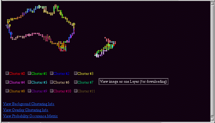
In the dual visualization, the checkboxes control the overlaid cluster result. The background image (what you get when all of the check boxes are unchecked) is the base visualization.
In addition to the visualization, you can also get the overlap statistics, and statistics on both clusterings. The highlighted text below the checkboxes give access to this data.