Principal components analysis [PCA] is a tool for manipulating and visualizing a data set, and for verfying and evaluting a particular clustering. It can be an extremely useful tool for understanding the relationships in a data set, but you have to be careful how you interpret the results.
PCA is, at its essence, a rotation and scalng of a data set. The rotation is selected so that the axes are aligned with the directions of greatest variation in the data set. The scaling is selected so that distances along each axis are comparable in a statistical sense. Rotation and scaling are linear operations, so the PCA transformation maintains all linear relationships.
The rotation and scaling for PCA are given by the eigenvectors and eigenvalues of the covariance matrix. The covariance matrix contains the relationships (correlations) between the variables in the data set.
One way to think about PCA is that it generates a set of directions, or vectors in the data space. The first vector shows you the direction of greatest variation in the data set; the second vector shows the next direction of greatest variation, and so on. The amount of variation represented by each subsequent vector decreases monotonically.
In many data sets, the variables are related to one another (sea surface temperature and air temperature along a coastline, for example). What this means is that there are usually fewer directions (vectors) of useful variation than there are variables in the data set. The directions of useful variation are sometimes called factors. The factors are weighted combinations of the variables, where the weights describe the influence of each variable on that factor. If there are fewer important factors than there are variables in the data, then we can express the data set with fewer variables. Furthermore, the new variables are independent, which is a good property for clustering and analysis.
So once you've executed a PCA, what can you do? The following table gives an overview.
| What can you do? | Summary | What's it good for? |
|---|---|---|
| Examine the eigenvalues associated with each principal component | Look at a plot of the eigenvalues from the first to the last principal component. The plot will generally fall off sharply from the first component and then level off. | This plot gives you an idea of how many independent factors there are in the data set. When the plot levels off, the remaining principal components do not explain much about the data set. Therefore, only the first N principal components really matter in terms of explaining the variation in the data. |
| Examine the principal components | Look at the numerical values associated with each variable for the first 2-3 principal components | This tells you what variables are the most important for each principal component. Variables with large magnitude weights in the principal component vector are more important. Variables with similar magnitudes are correlated. |
| Transform the data set | Project each data point onto the first N principal components, where N is determined as noted above (by looking at the plot of the eigenvalues). | This reduces the size of the data set and makes the variables independent, both of which generally make the clustering algorithms more effective. |
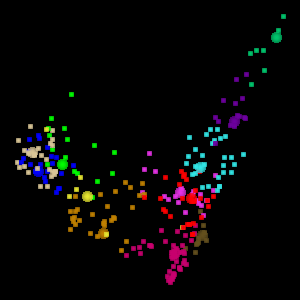
| Visualize the data projected onto the first 2-3 principal components | Take the dot product of each data point with the first 2 or 3 principal components. The resulting plot shows the data in the principal compoenent space (2D or 3D). | This is a good space in which to view the data. You can project the clusters into this space and verify whether they form coherent groupings. It may also give you a sense as to how many natural groupings exist in the data space |
There are lots of other sites devoted to PCA, factor analysis, and their applications. Here is one that is a nice description with biological examples. If you are comfortable with statistics, you might try this high-level discussion of PCA and factor analysis.
The Eigen t ab in WLV gives you access to the PCA tools. The screen shot below shows a visualization of the Australia Coast data set projected onto the first two principal components.
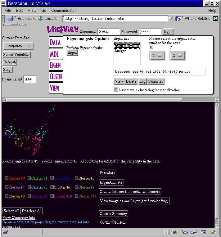
In order to get a plot like his you have to execute the following steps:
Like the standard visualization screen, if you have associated a clustering with the visualization, you can turn clusters on and off and view the cluster data. Likewise, you can generate a cluster summary in either PDF or HTML format.
As noted above, it is useful to have a plot of the eigenvalues. If you click on the EigenInfo button in the visualization frame it will bring up a window with a plot of the eigenvalues, and the numerical values for the eigenvectors. Below is an example plot of the eigenvalues for the Australia Cost data set (all variables).
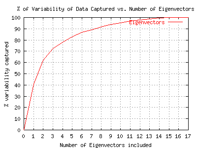
This example shows a typical eigenvalue plot. Depending upon your point of view, it would be possible to argue that anywhere from 4-10 of the principal components are important. The principal componenets from 10-17 account for less than 5% of the variability of the data set.
WLV also permits visualization of the data set in 3D, projected onto the first three principal components. To assist in visualizing the 3D space, the 3D projection is animated, as shown below. This is the visualization of 12 clusters in the Australia data set projected onto the first 3 principal components.