|
|
Results and Discussion
Web Structures
A goal of the technical team creating the atlas was to make
sure that original data and intermediate steps of the study were
saved and made available to the users. Results of field studies
were fed immediately into the databases. The flexibility of the
Web provides access to the data that went into the study at the
same time as the results.
To support these scientific goals, a design had to be created
for the web site. Several models were drawn up, but the goals
were very simple:
- Display information assembled
- Allow user to choose path and goals
- Don’t let user get lost.
Before the actual designs used in the DPA are described, some
discussion of general web style is needed.
Simple Web Structure
|
|
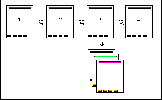
A simple, several-page report results in a simple web "report-like"
structure (Figure 3). Standard reports such as online Kansas
Geological Survey Public Information Circulars fit into this
category (ex. Hugoton Natural Gas Area of Kansas at
http://www.kgs.ku.edu/Publications/pic5/pic5_1.html). Each page links to the next page in the
sequence. The user may use a table of contents to skip to a particular
area (just as in a paper book), but there is a clear progression
of pages. Sometimes a page will have links to another web site,
just as a paper publication will have references to other sources.
Because people are familiar with reading reports, this style
of web presentation is not a significant problem for most viewers. |
|
|
Figure 3.—Schematic of simple report-like web structure. |
|
Hierarchical Web Structure
|
|
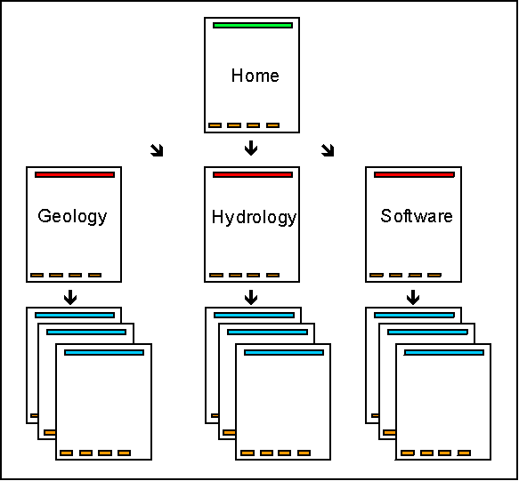
Web pages such as the Kansas Geological Survey home page (http://www.kgs.ku.edu/kgs.html)
can be seen as hierarchical "directory-like" structures
where the user is presented with a series of choices. Just as
in a library or grocery store, all of the information or items
available are grouped into several topics. Users do not have
trouble navigating this style of web site, which is similar to
that used for organizational charts and web directories such
as Yahoo (http://www.yahoo.com,
Lynch and Horton, 1997). |
|
|
Figure 4.—Schematic of hierarchical "directory-like"
web structure. |
|
However, the manner that a set of items is structured into
categories can lead to confusion. Upon reaching a web site, a
user must decide under which category a particular items has
been placed. What was obvious to the web designer may not be
an obvious choice to a visitor. Many products do not fit well
into the existing categories. For example, a multidisciplinary
product such as the Kansas River Corridor study (http://www.kgs.ku.edu/Publications/KR/index.html)
could be placed in both a "Geology" and "Hydrology"
category. Should it also be placed under "Publications?"
Is it considered useful as an "Educational" publication?
If too many publications are listed in multiple categories, then
the structure is not efficient in assisting users in locating
items of interest.
A search program can help in these cases. Studies show that
about half the people visiting a web site prefer to search right
away, and half the visitors prefer to navigate the site using
links (Nielsen, 1997a). However, since the answer to a particular
question may not be confined to one page, it is remains important
to have a strong web structure. Once the search has directed
a visitor to a particular web page, the visitor must easily discern
how to continue navigating through the site. |
|
Complex Web Structure
|
|
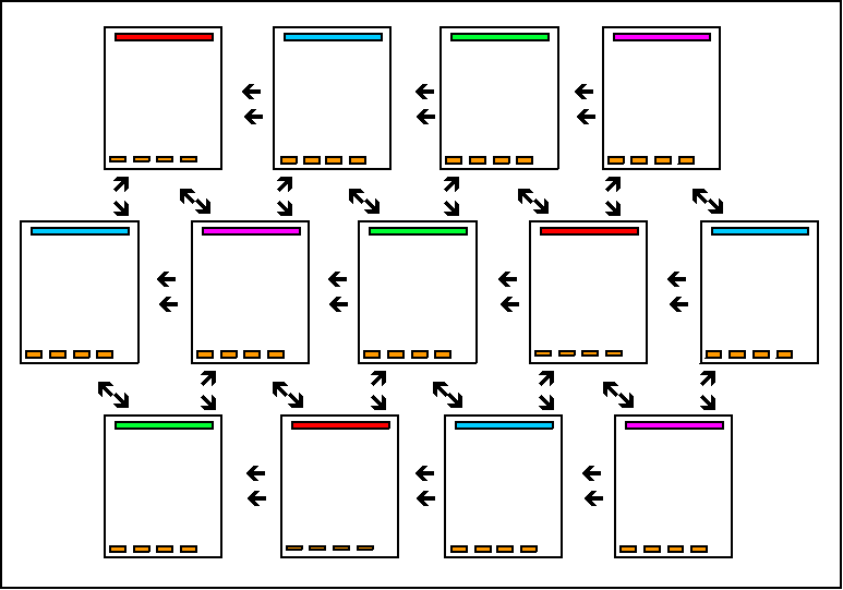
As soon as a web site has a significant number of pages on inter-related
subjects, there may be a tendency to see the site structure as
a true web. |
|
|
Figure 5.—Schematic of complex "web-like" web
structure. |
|
Inevitably, this is a mistake. While human consciousness might
very well work in a web-like way (words in conversation leading
to disparate topics, smells or sounds bringing up memories of
other places and times), an average visitor can not find answers
in a web structure. Except for a very small web site made up
primarily of links, this structure might be though of as an anti-structure. |
|
Atlas Structure
The DPA’s Two Major "Paths"
As the DPA got underway, there were two obvious "paths"
through the digital data. The user could move geographically
through several scales of data:
Play ® Basin ® County ®
Field ® Well
At each geographic scale, the user would be presented with
choices and answers.
- a. For this county, which field would you like to see?
- b. What is the structure of the Morrow in the basin?
- c. For this Field, which well are you interested in?
- d. For which Play is this field an analog?
As an alternative the DPA could be structured around topical
areas. For the first version of the DPA the topical areas were
broken into following categories:
- Regional General Geology
- Geophysics Reservoir Wells
For each field, basin and county, information was structured
in terms of both geographic scale and topical area. These two
general structural styles of information (pages based on geographical
scale and pages based on topical area) result in a grid system
(Figure 6). However, in practice this structure becomes rapidly
unmanageable. While it would be nice to simultaneously compare
the geologic maps of three or four fields (isopach or structure),
it is not possible and not desirable to have links from each
geology page to every other geology page. As a result, for the
DPA we emphasized movement among geographic scales, and worked
to maximize the visitor’s ability to move from County to
Field to Well. Movement between topical areas is restricted to
the selected geographic scale.
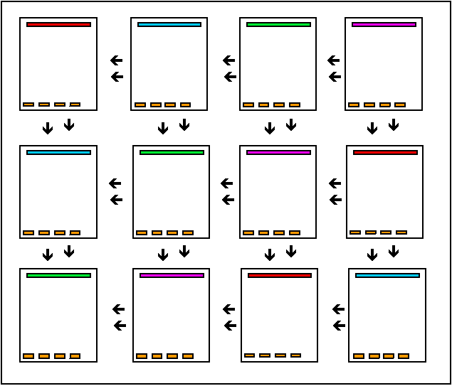
Figure 6.—Schematic of complex "grid-like"
web structure for the digital petroleum atlas. Rows can be visualized
as geographic scales (e.g., County, Field, Well) and columns
as topical areas (e.g., Geology, Geophysics, Production)
|