Original Navigation Style
In year one of the DPA project the top strip of buttons allowed the user to move to the Home or Kansas pages as well as move out of the DPA to the Kansas Geological Survey or Petroleum Technology Transfer Council (PTTC) home pages (Figure 10).. The first version did not include the Site Map button. Underneath the top row of buttons was a string of text links that were intended to allow the user to move up and down the geographic scale path (Figure 10).
At the bottom of the page were the buttons for navigating through the different topical areas (Figure 11). The gray Topic Buttons were designed to look "pressed in" (like car radio buttons) to show the visitor which topic they were exploring. The orange Local Buttons were for moving back and forth within a topic. For example, to move from one geology page to another, the user could click on the stratigraphic chart that was next to each geologic map. However, on small computer monitors, using the chart to navigate was not obvious.
After the DPA was up and running for a year, several problems developed:
- Local navigation buttons at bottom of page.--One problem with designing the DPA on an office bulletin board was that the DPA was not going to be viewed on an office bulletin board. Local navigation (within the "Geology" topic, for example) was a problem because on 13"-15" computer screens, navigation using the stratigraphic charts was not an obvious option. In addition, if a visitor found their way to an atlas page, it was not obvious what topic they had entered or what other topics were available. Nielsen (1977b) found that in 1994 only 10% of visitors would scroll AT ALL to view the remainder of a web page. Visitors were used to dialog boxes where all choices are visible. He found in 1997 that more people were scrolling than before. It is possible that our pages, where it is obvious that a visitor must scroll to see all of a map, did not fall into that much of a trap. In addition, many users will decide, based on the top of a web page, what it is they are viewing and if they are interested enough in it to wait for the entire page to load. Lynch and Horton (1997) state that the web page must deliver significant information in the top 4" of a web page. Using this criterion our first web design, which placed significant navigation at the bottom of each page, had significant problems.
- Each field needs custom regional pages.--Because our first DPA work included only county and field information, we added regional information to each field. However, after three fields were online, it was obvious that some of the regional maps needed to be duplicated across several fields. Soon after that, a new area of the DPA was added that contained information from a U.S.G.S. CD-ROM (U. S. Geological Survey, 1995) describing plays and basins on a national scale. There were no obvious ways to connect the regional data for each field to this new data, and work on regional maps could not be leveraged for several fields.
- Once USA, Play, or Mid-continent areas were built, there was no way to integrate fields.--In addition to the U.S.G.S. data, pages describing all the plays for the mid-continent were added, and several more state-wide maps were added. Again, none of these regional data were connected to the field pages.
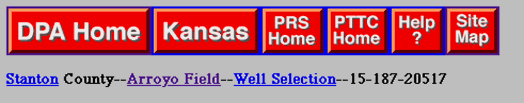
Figure 10.—Sample or original top strip of navigation buttons that provided links among major areas of the DPA and geographic scale.
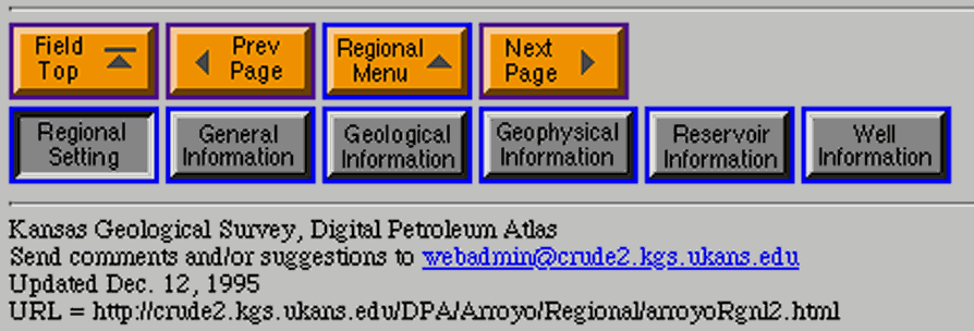
Figure 11.—Sample or original bottom strip of navigation buttons that provided links among topical areas within a selected geographic area.
Revised Navigation Style
Based on feedback from our users in the second year of the project we reviewed and modified the navigation structure. The goals of the new navigation style were to:
- Move all navigation to top of page;
- Make more obvious the links to county, basin, and play;
- Create a template that works for different areas in DPA;
- Use more a modern style.
Highlights of this design included a separation of DPA buttons from external buttons. The original DPA pages had links to KGS or PRS and PTTC on every page. Now those links are placed only on the home page. There is also a clear separation between the three kinds of navigation (DPA, Topic, and Local). A yellow color (instead of a pressed-in look) in used to show which topic this page is assigned to. Finally, the text links placed in the top half of the center panel show distinctly what Play, Basin, and County the current field belongs to. The "Regional" topic button has been removed and the information moved to the "Basin" link.
Most importantly, all the navigation is placed at the top of a page. There is a clear indication at the very top what field (or county, or basin) the visitor has reached. It is obvious what topics are available. The user does not have to scroll below the map being loaded (or even wait for a map to draw completely) before choosing a topic. For field page, we added a "field site map" to aid in navigation.
The County pages also show more sophisticated navigation buttons. The Play information is better integrated with the county pages. The Production button could sends the visitor to DPA production pages at some future date, but for now shows them the standard Oil and Gas Production pages.
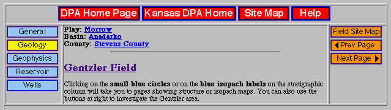
Figure 12.--Sample of revised field page style providing all navigation information at top of the page. (DPA-wide navigation at top; Topic navigation at left Local navigation at right)
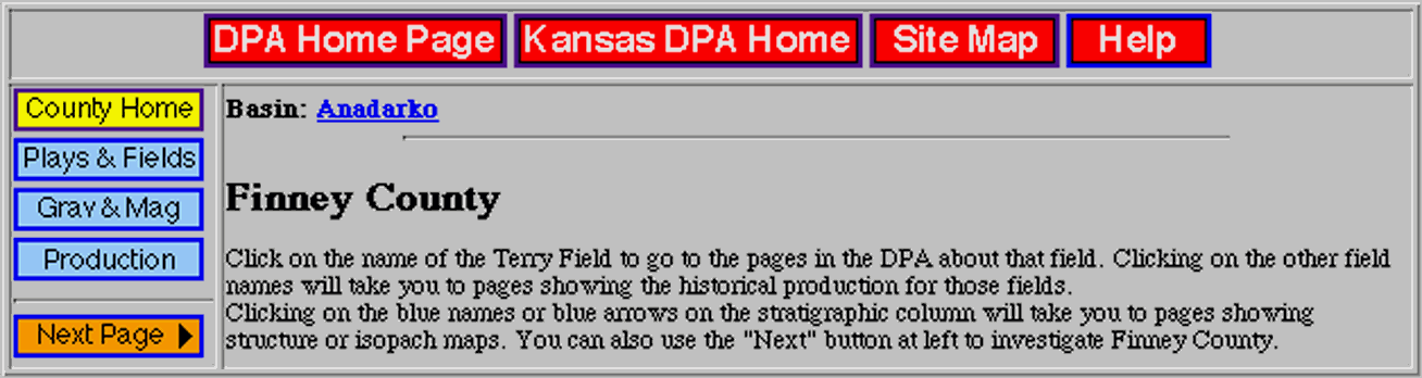
Figure 13.--Sample of revised county page style providing all navigation information at top of the page. Individual field studies can be accessed through attached interactive map. (DPA-wide navigation at top, Topic and Local navigation at left)
| Previous Page | Major DPA Paths & Pages | Next Page | Tech Transfer/Conclusions |